The Post
Vancouver, BC
New life for an architectural icon.
SERVICES
DISCOVERY
- Competitive Analysis
- Market Research
- Trendscaping
- Audience Studies
- Creative Workshops
brand strategy
- Positioning
- Brand Definition
- Naming
- Brand Guidelines
BRAND DESIGN
- Visual Identity
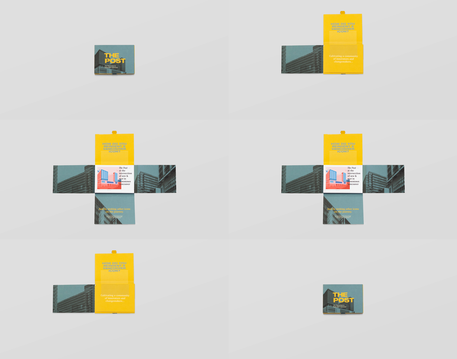
- Collateral Design
- Website Design
- Photography Creative Direction
- Production Management
EXPERIENCE STRATEGY
- Guest Experience
- Customer Journeys
- Visioning & Master Planning
AWARDS
Muse design awards
- Conceptual Public Space,
Silver
CREDITS
AvroKO, Interior Design
The Approach
Vancouver’s Main Post Office, completed in 1958, featured cutting-edge technology. It helped usher in the city’s midcentury boom that endures to the present day. We worked to create a brand positioning and visual identity that points the way forward by reconfiguring elements of the past.
The Expression
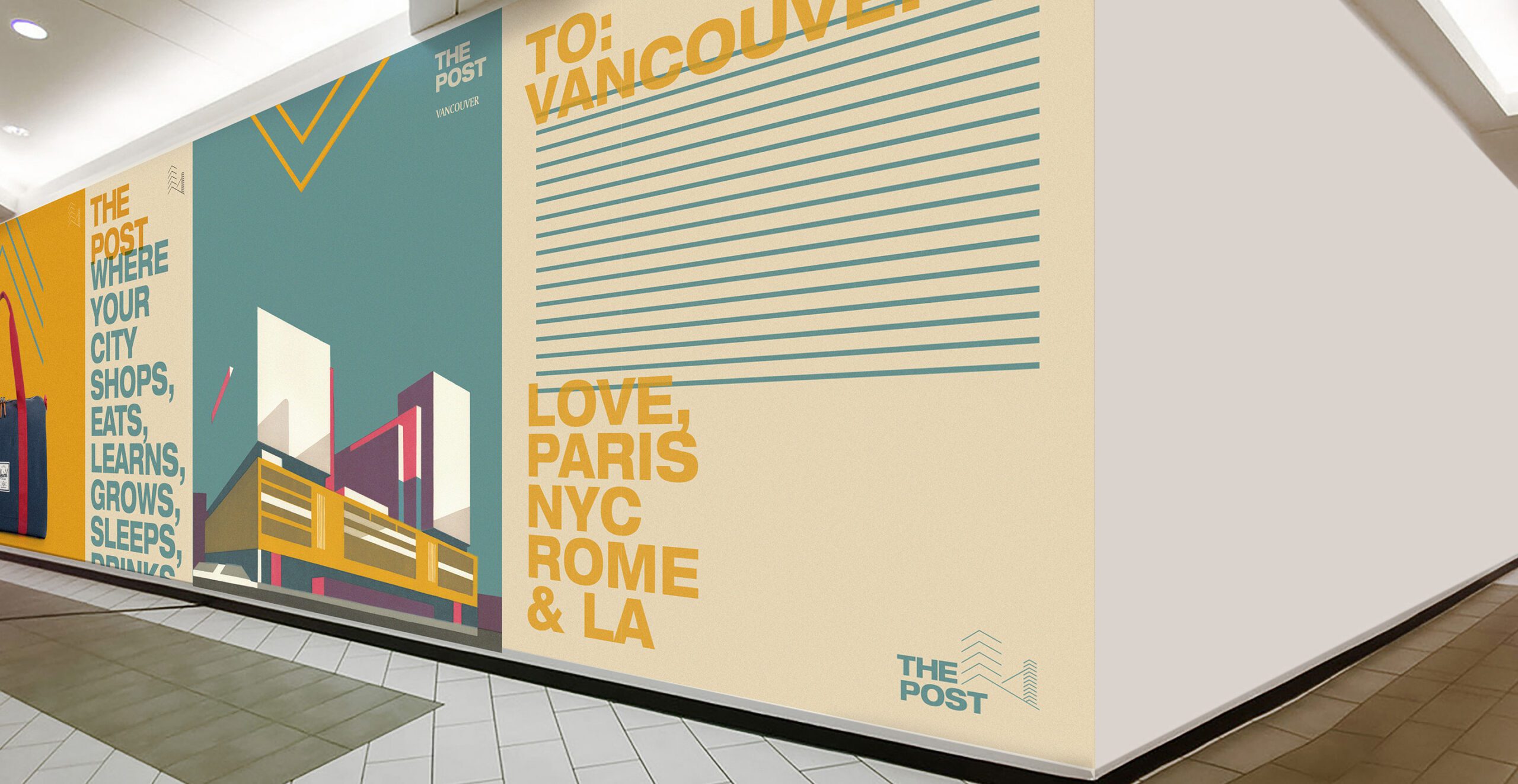
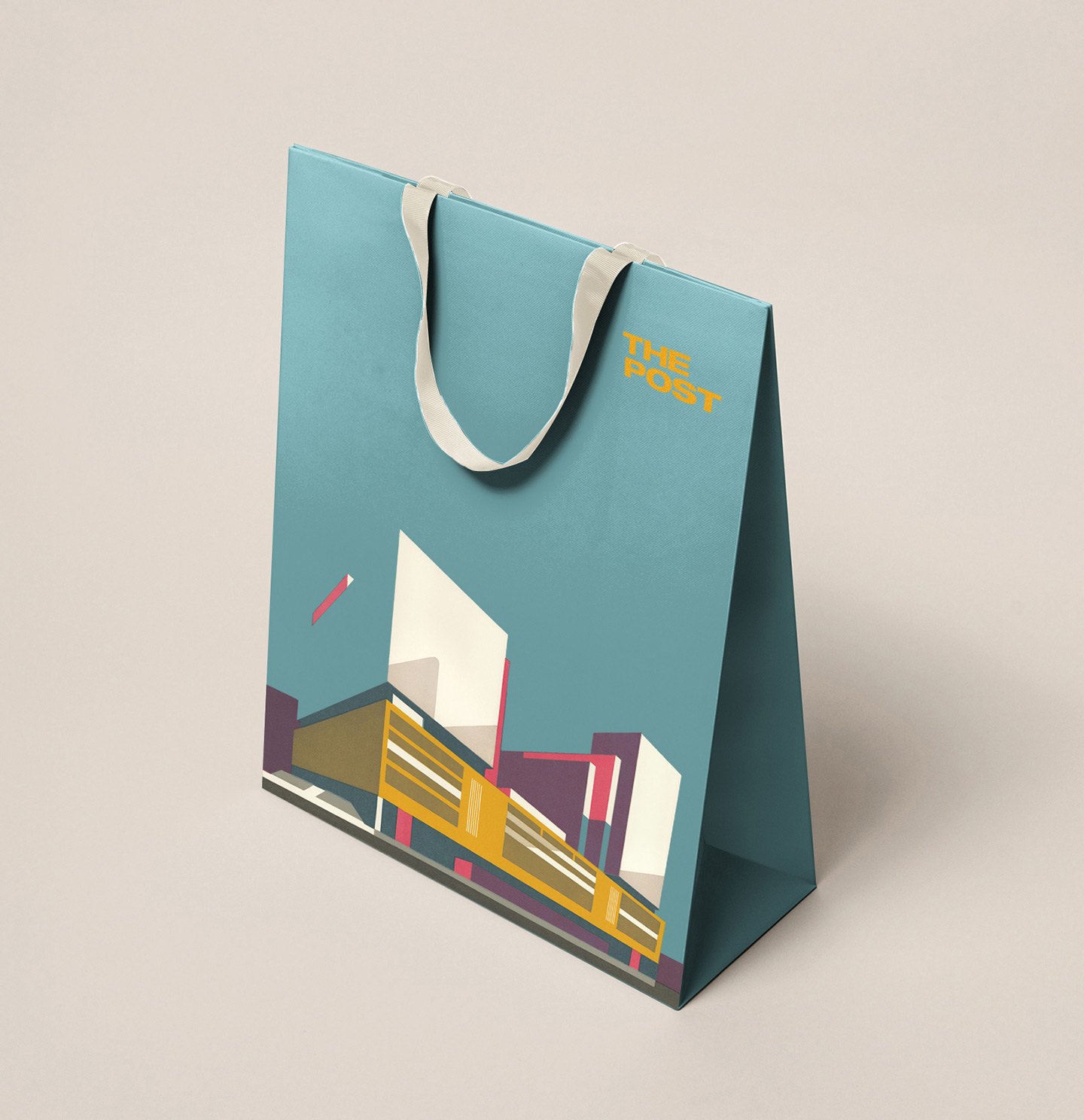
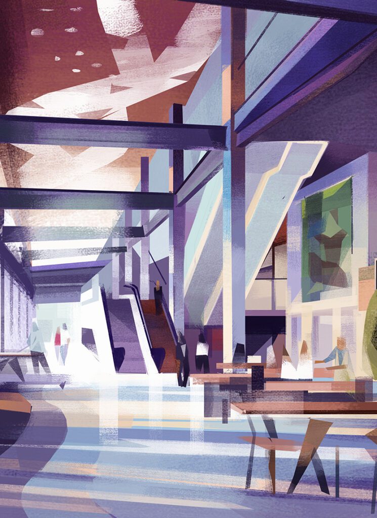
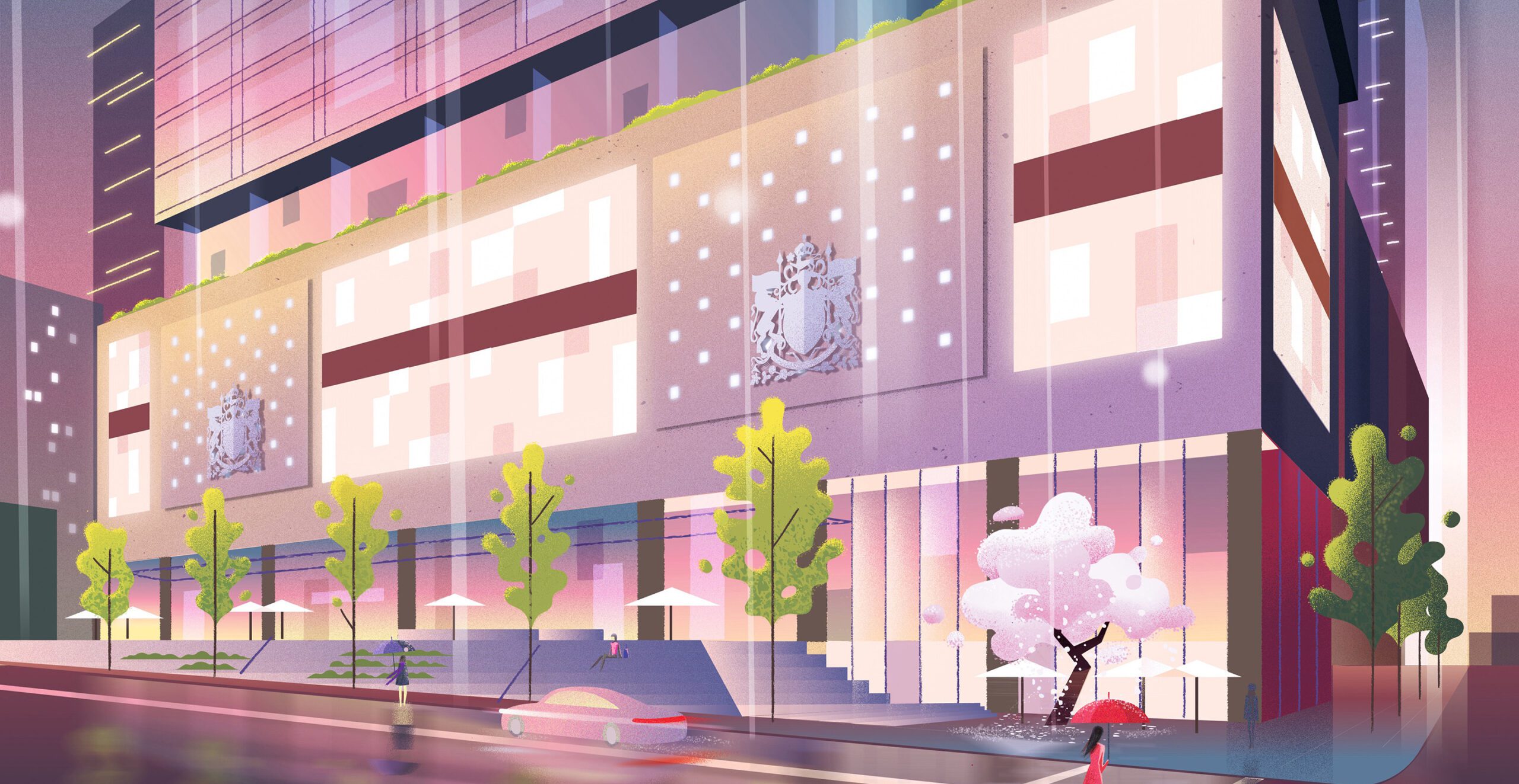
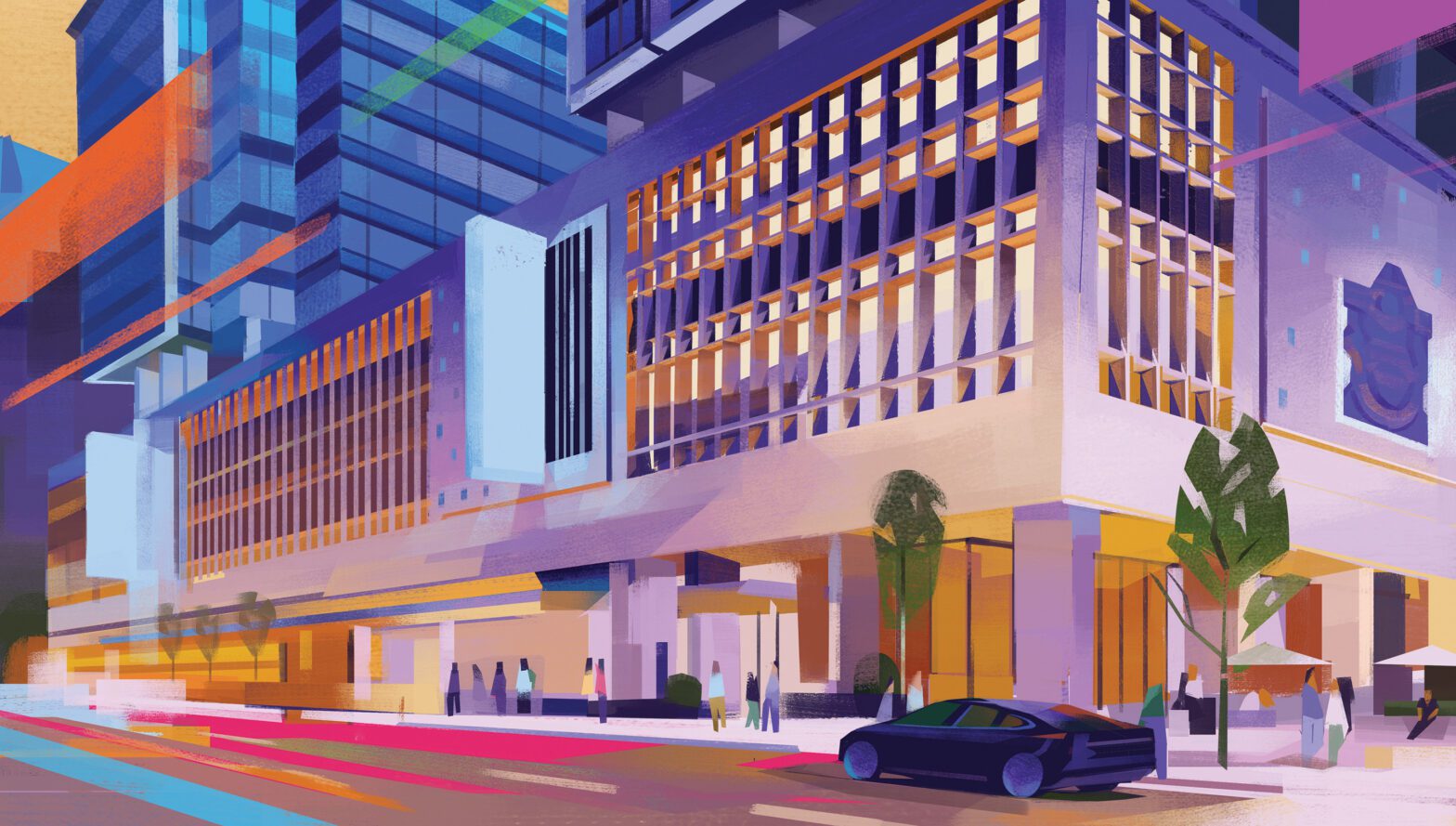
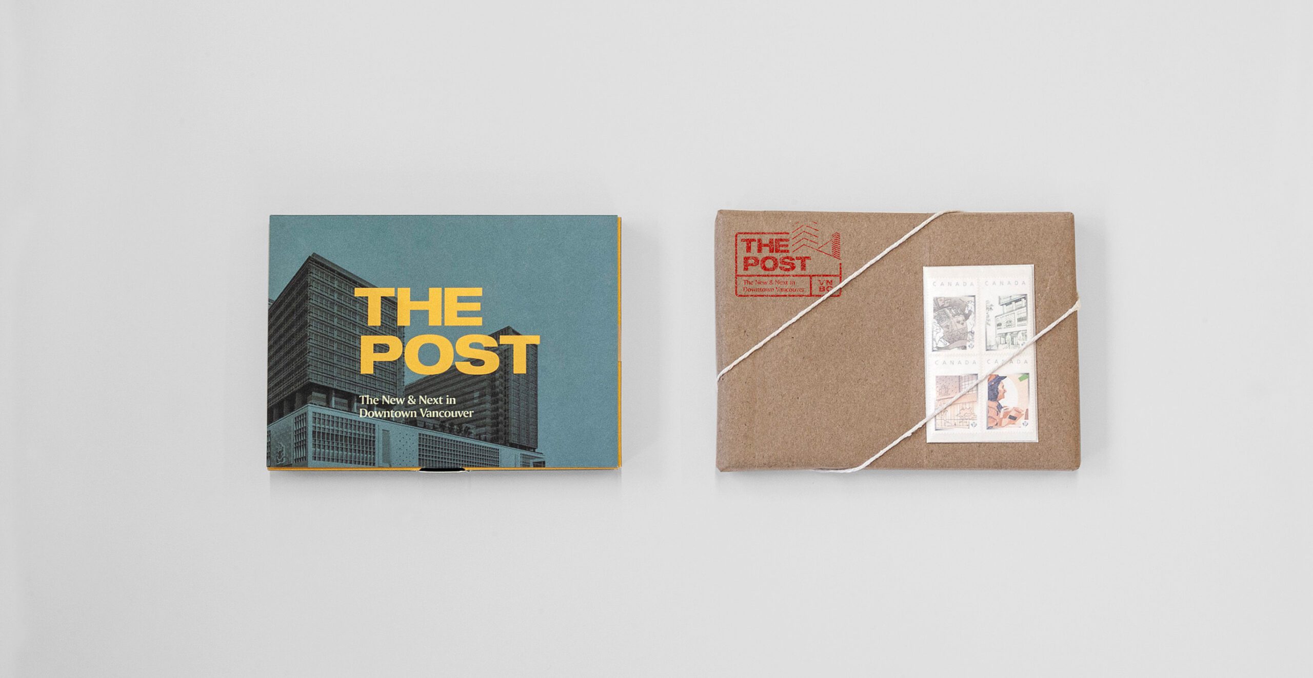
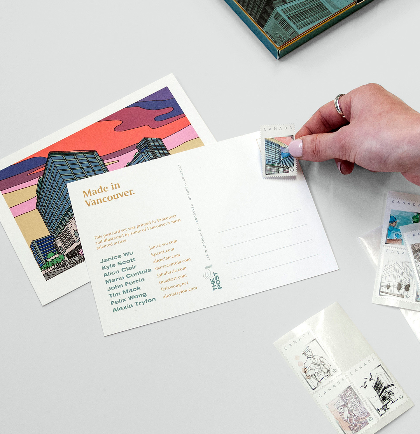
Colorful, minimal, modernist-inspired illustrations share space with archival stamps and historical photography. They highlight the building’s granite details, cast concrete, terrazzo flooring, terra cotta panels, and a 730-meter underground conveyor belt system. These details evoke nostalgia while celebrating contemporary culture and community.
The Space
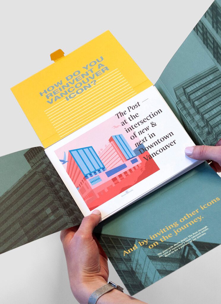
The identity’s graphic elements were inspired by maps and transportation signage, mirroring a postal journey. Photo treatments add contrast and noise, hearkening back to an earlier era. Printmaker Paul Catherall contributed a sharp linocut print that balances abstract color blocks with crisp forms.
