Orla
Santa monica, California
A culinary love letter to Mediterranean heritage and hospitality.
THE ASK
To transform an established Mina Group restaurant into a scalable Mediterranean concept with crossover appeal.
SERVICES
BRAND STRATEGY
- Repositioning
- Brand Definition
- Naming
BRAND DESIGN
- Brand Identity
- Collateral Design
CREDITS
AvroKO, Interior Design
Andrew Bui, F&B Photography
Tanveer Badal, Interior Photography
The Approach
Chef Mina’s Egyptian heritage fueled our deep dive into the Mediterranean’s rich sensory archive—spice-laden bazaars, sun-warmed pottery, the rhythm of traditional hospitality—to craft a concept that could authentically translate across markets while maintaining its culinary soul.
The Expression
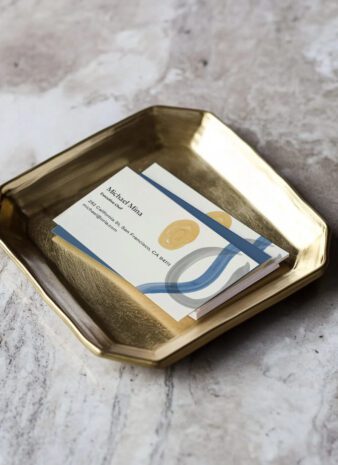
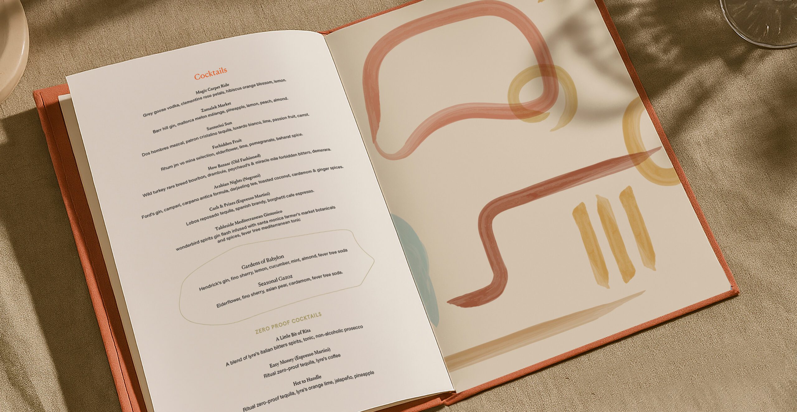
“Orla” embodies the golden light that bathes Mediterranean shores and warmth of its legendary hospitality. Our identity captures this radiance through honey-hued accents and fluid forms reminiscent of ancient amphora and coastal landscapes.

The System
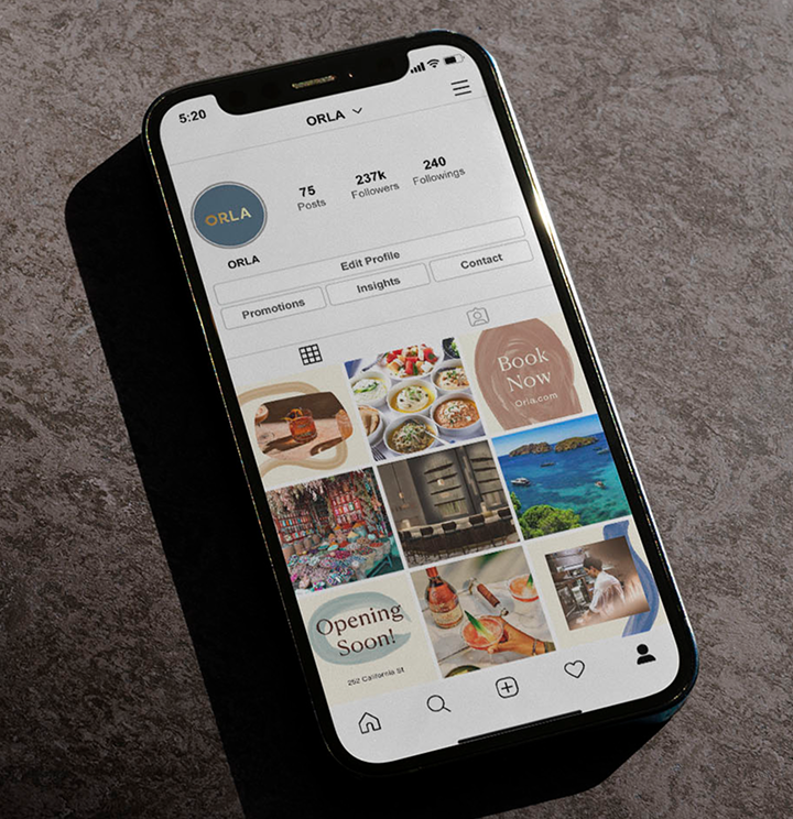
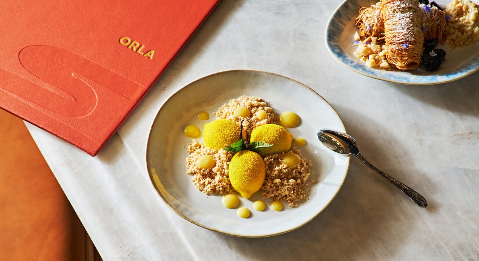
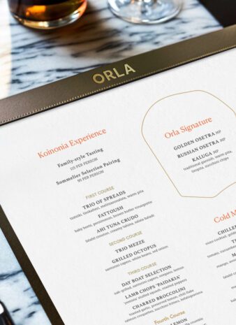
The identity’s hues reads like a love letter to coastal landscapes—aquamarine, terracotta, sun-bleached stone. Organic shapes dance across collateral, while gold foil accents catch the light—transforming menus, cards, and packaging into artifacts of a journey well-traveled.